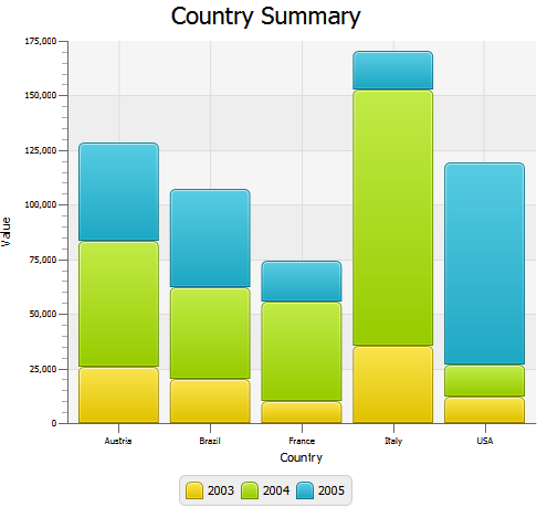
Description of "Figure 7-4 Stacked Bar Chart with Five Categories of Data"
Compare the data shown in Figure 7-3 with the same data in Figure 7-4. The areas in the stacked bar chart show cumulative values on the vertical axis at any given point along the horizontal axis. For example, on the vertical axis of Figure 7-4, the 2004 values for Austria range from approximately 25,000 to approximately 85,000. However, the data in Example 7-4 indicates a value of 57,401.85 for Austria in 2004. The 2004 high value of approximately 85,000 in Figure 7-4 represents the cumulative results for Austria in 2003 and 2004.
When you develop bar charts in your JavaFX application, remember that data on the vertical axes are interpreted differently for a BarChart than for a StackedBarChart. Choose the type of chart that best illustrates the task of the application.
You can specify the distance between the stacked categories by setting the value in the setCategoryGap method. For example, you can set the distance of 50 pixels for the Country Summary bar chart: sbc.setCategoryGap(50);
When you apply this method to the stacked bar chart in Example 7-4, the bar categories look as shown in Figure 7-5.
Figure 7-5 Stacked Bar Chart with the Specified Gap Between the Categories
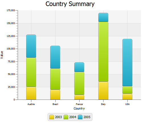
Description of "Figure 7-5 Stacked Bar Chart with the Specified Gap Between the Categories"
Animating Data in Charts
You can implement animated charts to illustrate dynamic behavior of financial activities. Example 7-5 defines an animation timeline and creates key frames to randomly set the X value for the data of the bar chart. The timeline starts when the application does and continues indefinitely in the auto-reverse mode.
| Example 7-5 Animating Data in a Bar Chart
Timeline tl = new Timeline();
tl.getKeyFrames().add(
new KeyFrame(Duration.millis(500),
new EventHandler<ActionEvent>() {
@Override public void handle(ActionEvent actionEvent) {
for (XYChart.Series<Number, String> series: bc.getData()) {
for (XYChart.Data<Number, String> data: series.getData()) {
data.setXValue(Math.random() * 1000);
}
}
}
}
));
tl.setCycleCount(Animation.INDEFINITE);
tl.setAutoReverse(true);
tl.play();
|
When you add this code fragment to the Country Summary application in Example 7-3, and then compile and run the modified code, you will notice that both the axis and the chart plot change smoothly to accommodate new values in ranges and new lengths of the bars. This is because of the animated properties of the Chart and Axis classes. By default, they set to true to animate any data changes.
For the Country Summary application, you can prohibit animating data along the vertical axis when the data on this axis is presented in categories and does not change. To avoid undesirable flickering of the country labels, use the setAnimated method as shown in Example 7-6.
| Example 7-6 Managing Animation of Data Changes
yAxis.setAnimated(false);
|
See the Ensemble application and the API documentation for more information about the features and capabilities of JavaFX charts.
Related API Documentation
- BarChart
- Chart
- XYChart
- XYChart.Data
- XYChart.Series
- Axis
- NumberAxis
- CategoryAxis
- Timeline
- KeyFrame
Styling Charts with CSS
This chapter explains how to change the default appearance of JavaFX charts by applying Cascading Style Sheets (CSS). Learn how to change a chart color scheme, modify its legend or axes, and alter chart symbols.
All visual elements of JavaFX charts are defined by the caspian style sheet. The JavaFX API has a limited set of methods and properties to alter these visual elements. Oracle recommends that you use the chart-specific CSS properties to implement an alternative look and feel for charts in your JavaFX application.
You can find a complete list of the chart-specific properties in the JavaFX CSS Reference Guide. When you apply CSS styles to your charts, refer to Skin JavaFX Applications with CSS for implementation details.