Description of "Figure 5-4 Demonstrating Percentage of Consumed Budget"
Changing the Appearance Visual Setting of the Plot and Tick Marks
You can alter the appearance of the chart plot and axes. Examine some methods and properties available in the JavaFX SDK API to modify the look of the Budget Monitoring application.
There are four properties in the XYChart class to manage the appearance of the chart plot. The alternativeColumnFillVisible and alternativeRowFillVisible properties define whether the alternative rows and columns have the fill colors. The verticalGridLinesVisible and horizontalGridLinesVisible properties enable and disable showing the grid lines. Table 5-1 shows the default values for these properties.
Table 5-1 Default Values of the Chart Plot Properties
| Property
| Default Value
|
| alternativeColumnFillVisible
| false
|
| alternativeRowFillVisible
| true
|
| verticalGridLinesVisible
| true
|
| verticalZeroLineVisible
| true
|
Alter these properties by using the corresponding methods as shown in Example 5-4 to modify the look of the chart plot.
| Example 5-4 Visualizing Alternative Columns
blc.setAlternativeColumnFillVisible(true);
blc.setAlternativeRowFillVisible(false);
|
In addition to the plot properties, you can modify the properties of the axis to attain the required appearance. Code lines in Example 5-5 specify the CHOCOLATE color for the tick labels.
| Example 5-5 Defining a Fill Color for the Tick Labels
xAxis.setTickLabelFill(Color.CHOCOLATE);
yAxis.setTickLabelFill(Color.CHOCOLATE);
|
Finally, you can adjust the position of the tick labels relative to the tick marks. Use the setTickLabelGap method to specify the gap between tick labels and the tick mark lines on the vertical axis: yAxis.setTickLabelGap(10).
Figure 5-5 shows the output of the Budget Monitoring application after all the modifications are incorporated in the code.
Figure 5-5 Changes in the Appearance of the Bubble Chart

Description of "Figure 5-5 Changes in the Appearance of the Bubble Chart"
Related API Documentation
- BubbleChart
- Chart
- XYChart
- XYChart.Data
- XYChart.Series
- NumberAxis
- NumberAxis.DefaultFormatter
Scatter Chart
This chapter describes the scatter chart, a two-axis chart that presents its data as a set of points.
Each point is defined by an X and Y value. Similar to any other two-axis chart, you can create one or several series of data. Figure 6-1 illustrates a scatter chart with three series of data.
Figure 6-1 Sample of the Scatter Chart
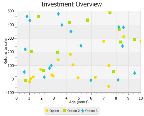
Description of "Figure 6-1 Sample of the Scatter Chart"
Creating a Scatter Chart
To create a scatter chart, define at least one series of data, set horizontal and vertical axes, create the chart by instantiating the ScatterChart class, and assign data to the chart. Example 6-1 demonstrates how to create a simple scatter charts with two series of data.
| Example 6-1 Scatter Chart with Two Series of Data
import javafx.application.Application;
import javafx.scene.Scene;
import javafx.scene.chart.NumberAxis;
import javafx.scene.chart.ScatterChart;
import javafx.scene.chart.XYChart;
import javafx.stage.Stage;
public class ScatterChartSample extends Application {
@Override public void start(Stage stage) {
stage.setTitle("Scatter Chart Sample");
final NumberAxis xAxis = new NumberAxis(0, 10, 1);
final NumberAxis yAxis = new NumberAxis(-100, 500, 100);
final ScatterChart<Number,Number> sc = new
ScatterChart<Number,Number>(xAxis,yAxis);
xAxis.setLabel("Age (years)");
yAxis.setLabel("Returns to date");
sc.setTitle("Investment Overview");
XYChart.Series series1 = new XYChart.Series();
series1.setName("Equities");
series1.getData().add(new XYChart.Data(4.2, 193.2));
series1.getData().add(new XYChart.Data(2.8, 33.6));
series1.getData().add(new XYChart.Data(6.2, 24.8));
series1.getData().add(new XYChart.Data(1, 14));
series1.getData().add(new XYChart.Data(1.2, 26.4));
series1.getData().add(new XYChart.Data(4.4, 114.4));
series1.getData().add(new XYChart.Data(8.5, 323));
series1.getData().add(new XYChart.Data(6.9, 289.8));
series1.getData().add(new XYChart.Data(9.9, 287.1));
series1.getData().add(new XYChart.Data(0.9, -9));
series1.getData().add(new XYChart.Data(3.2, 150.8));
series1.getData().add(new XYChart.Data(4.8, 20.8));
series1.getData().add(new XYChart.Data(7.3, -42.3));
series1.getData().add(new XYChart.Data(1.8, 81.4));
series1.getData().add(new XYChart.Data(7.3, 110.3));
series1.getData().add(new XYChart.Data(2.7, 41.2));
XYChart.Series series2 = new XYChart.Series();
series2.setName("Mutual funds");
series2.getData().add(new XYChart.Data(5.2, 229.2));
series2.getData().add(new XYChart.Data(2.4, 37.6));
series2.getData().add(new XYChart.Data(3.2, 49.8));
series2.getData().add(new XYChart.Data(1.8, 134));
series2.getData().add(new XYChart.Data(3.2, 236.2));
series2.getData().add(new XYChart.Data(7.4, 114.1));
series2.getData().add(new XYChart.Data(3.5, 323));
series2.getData().add(new XYChart.Data(9.3, 29.9));
series2.getData().add(new XYChart.Data(8.1, 287.4));
sc.getData().addAll(series1, series2);
Scene scene = new Scene(sc, 500, 400);
stage.setScene(scene);
stage.show();
}
public static void main(String[] args) {
launch(args);
}
}
|
In this example, the ScatterChart object is created with two Number axes to present numerical data for years and amounts of returns. The range of the data and the tick unit are defined within constructors of the NumberAxis class.
The result of compiling and running this application is shown in Figure 6-2.